
Caption Contest Winner!
Books and No Books


I have chosen a winner for my latest caption contest, using the word “caption” loosely, as it should maybe more accurately be called a “fill-in-the-signs” contest.
Looking over the entries, I began to realize that there are two different ways of reading the image, which affected the types of captions submitted. First I’ll explain the way I understood the image.
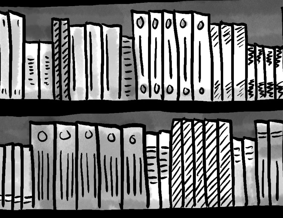
I picture this being in a bookstore and the signs at the top are labeling the genres of books that are being sold on the bookshelves below. On the left the shelves are full because these are some type of books that no one wants, that no one is buying. On the right the shelves are empty because these are some type of books that a ton of people want, that are popular or trendy, and thus they have almost all been bought. I stuck with this framing of the image because on the shelf on the left, there are multiples of the same type of book, as you might see if you went to a bookstore. For example, there’s 3 copies of one book, 5 copies of another, 4 copies of another. You can tell this because they have the same design and size of spines.
Unfortunately, operating on this assumption, some people’s captions didn’t make sense.
However they did make sense if you read this image in a different way than I intended. Instead, if you viewed these bookshelves more as a collection of books that someone owns, then the shelf on the left houses the books that someone actually wanted, that they purchased, that they own. The shelf on the right is empty because it’s books they have not purchased, do not own, aren’t interested in, and therefore don’t have many of. Viewing the image this way is almost the opposite of the way I intended it.
It seemed like a pretty even split, about half the people interpreting it one way and half the people interpreting it the other. I thought about considering captions from both perspectives, but in the end I just couldn’t get down with the second way. So that helped me narrow down the captions a bit.
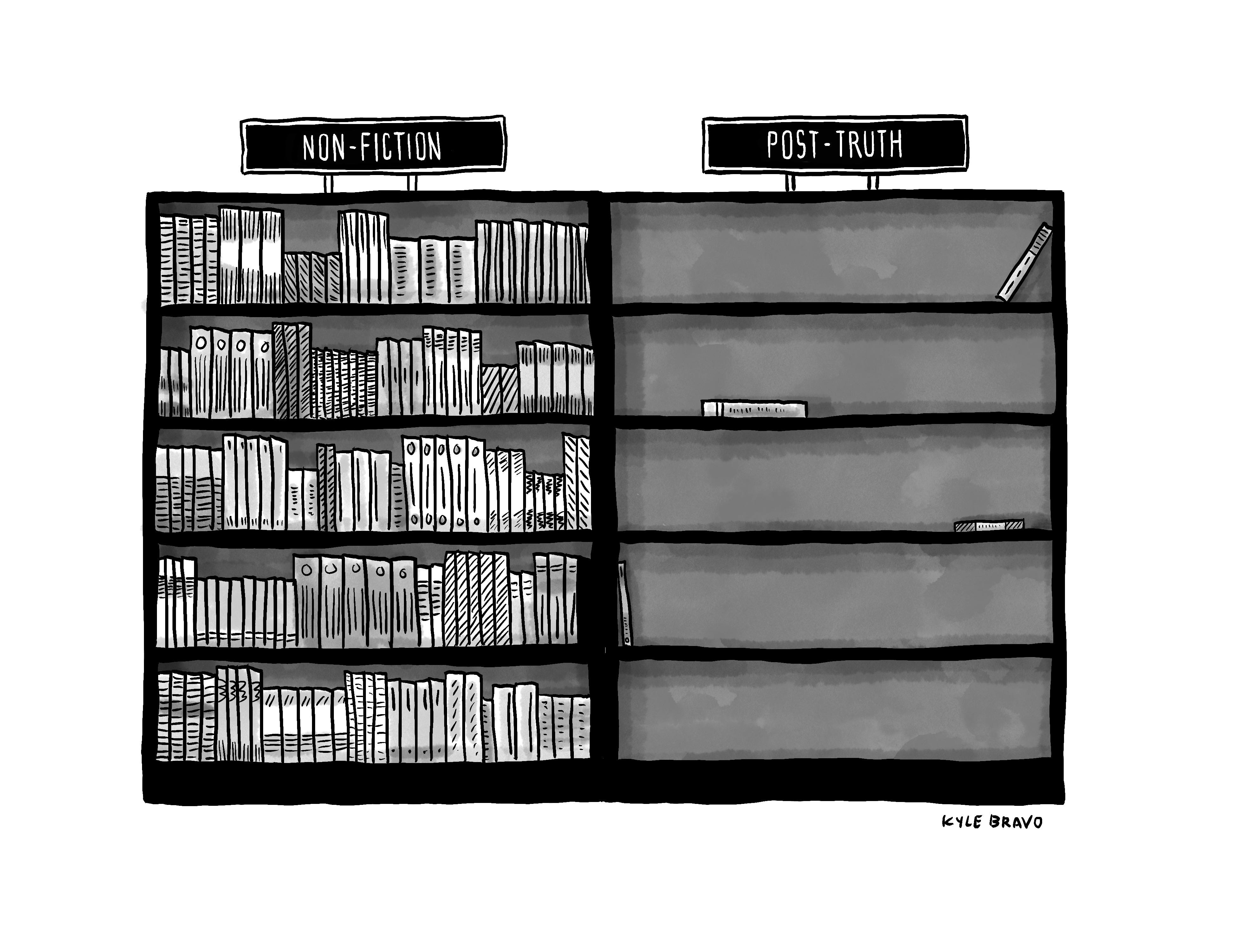
Many of the captions hit on common dichotomies and oppositions prominent in our contemporary world, but, for that reason, most of them felt a little too obvious to me. I “got“ them, but I didn’t necessarily find them funny. My original caption for this cartoon was similar. On the left I had “Non-Fiction“ and on the right I had “Post-Truth.“ I still think it’s decent, but no one bought it, so, oh well.
In the end there was one caption that caught me off guard, that made me chuckle, and that is the one I have chosen as the winner. And the winner is…
“Self-Help” and “Help Yourself” by John Konno @johnkonno
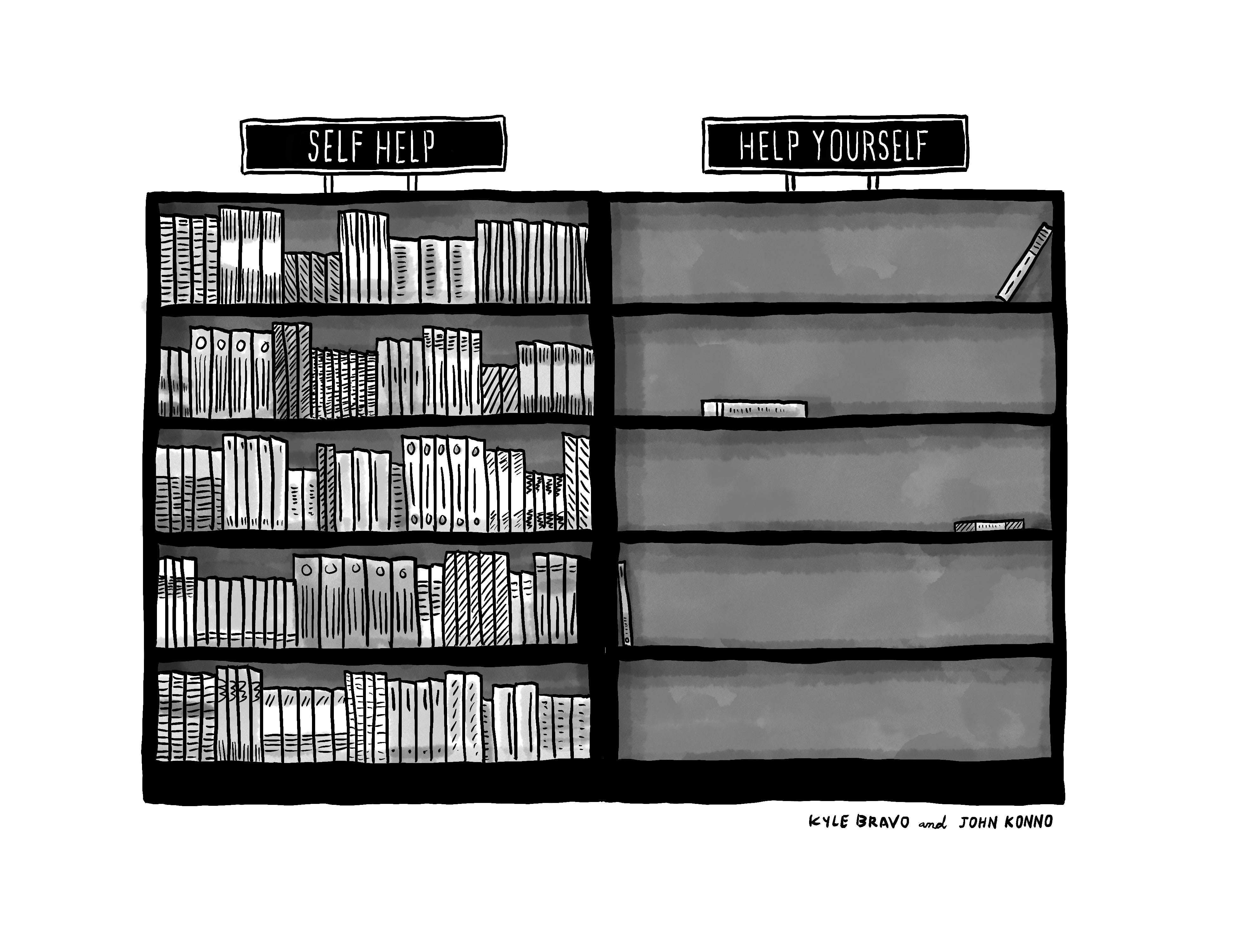
I like this one because of the double meaning of “help yourself.” On the one hand “help yourself” could be thought of as a genre akin to “self-help,” but then the other meaning of “help yourself” could be, “take all the books you want.” Thus, the shelf is empty because people have “helped themselves.” I like that it played on the stereotypical genre of self-help books but then threw in an unexpected twist on the term that gave it a double meaning that made sense and caught me off guard. Many people played around with the idea of “self-help“ but John’s joke was original and unique. I also liked that it followed the correct joke structure of set up at the beginning and punchline at the end. Some people’s captions had the joke structure reversed, where the joke was in the sign on the left more so than the sign on the right, which just isn’t how jokes work. Formally I thought this one was structured nicely.
Very smart, very clever. I’m familiar with John’s name from The New Yorker and Cartoonstock caption contests, so I know he’s a heavy hitter. Once again he has “helped himself” to a win. I will make a print of his version, sign it, and mail it to him. Congrats, John Konno!
A few runners up:
